Skip to content
Portfolio
Design for wellness
About
Services
Press
Blog
Contact
Menu
Portfolio
Design for wellness
About
Services
Press
Blog
Contact
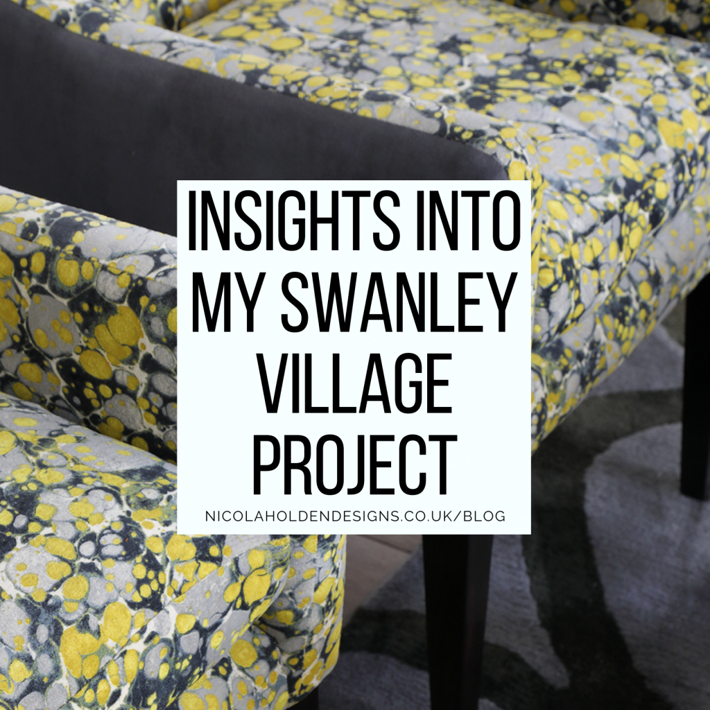
Insights into my Swanley Village Project
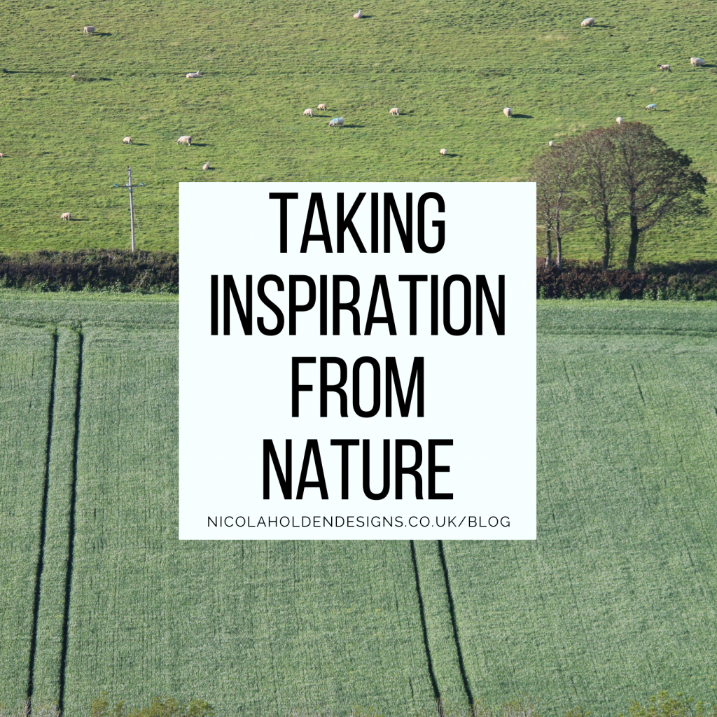
Taking Inspiration from Nature
How To Zone Your Kitchen: Seven Tips To Create The Perfect Layout
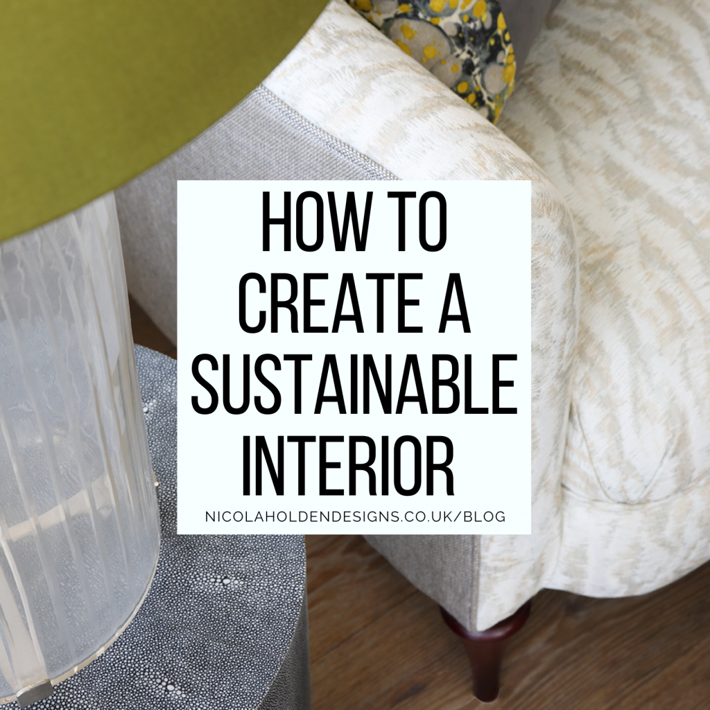
How to Create a Sustainable Interior
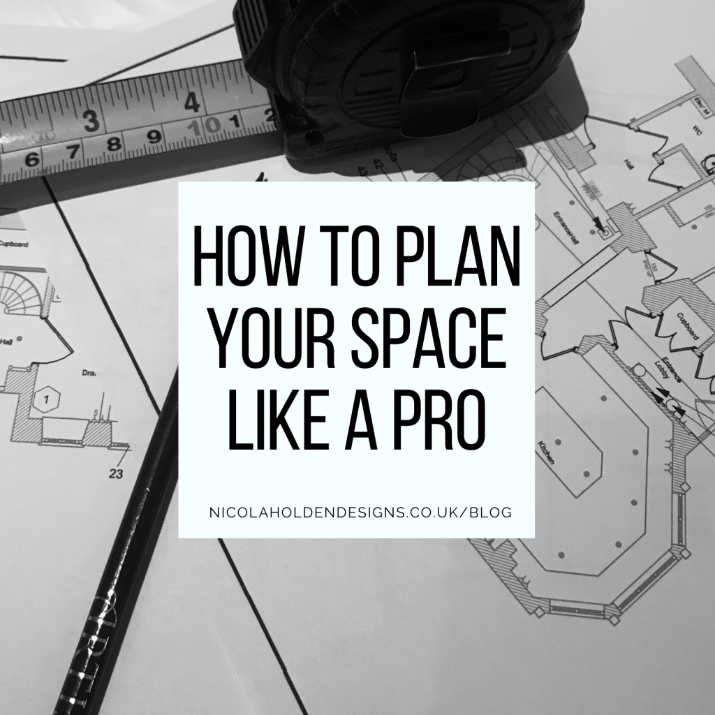
How to plan your space like a pro
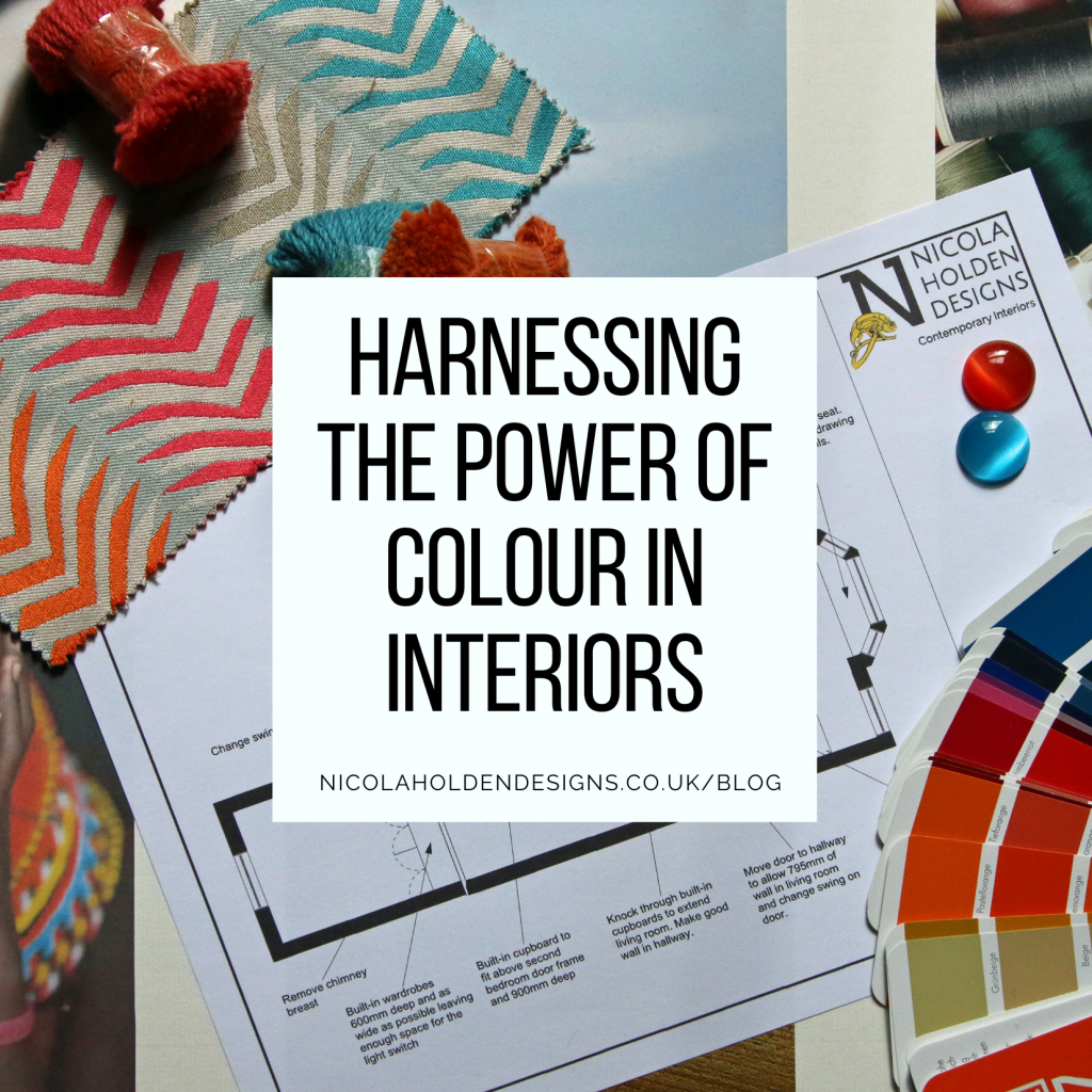
Harnessing the Power of Colour in Interiors
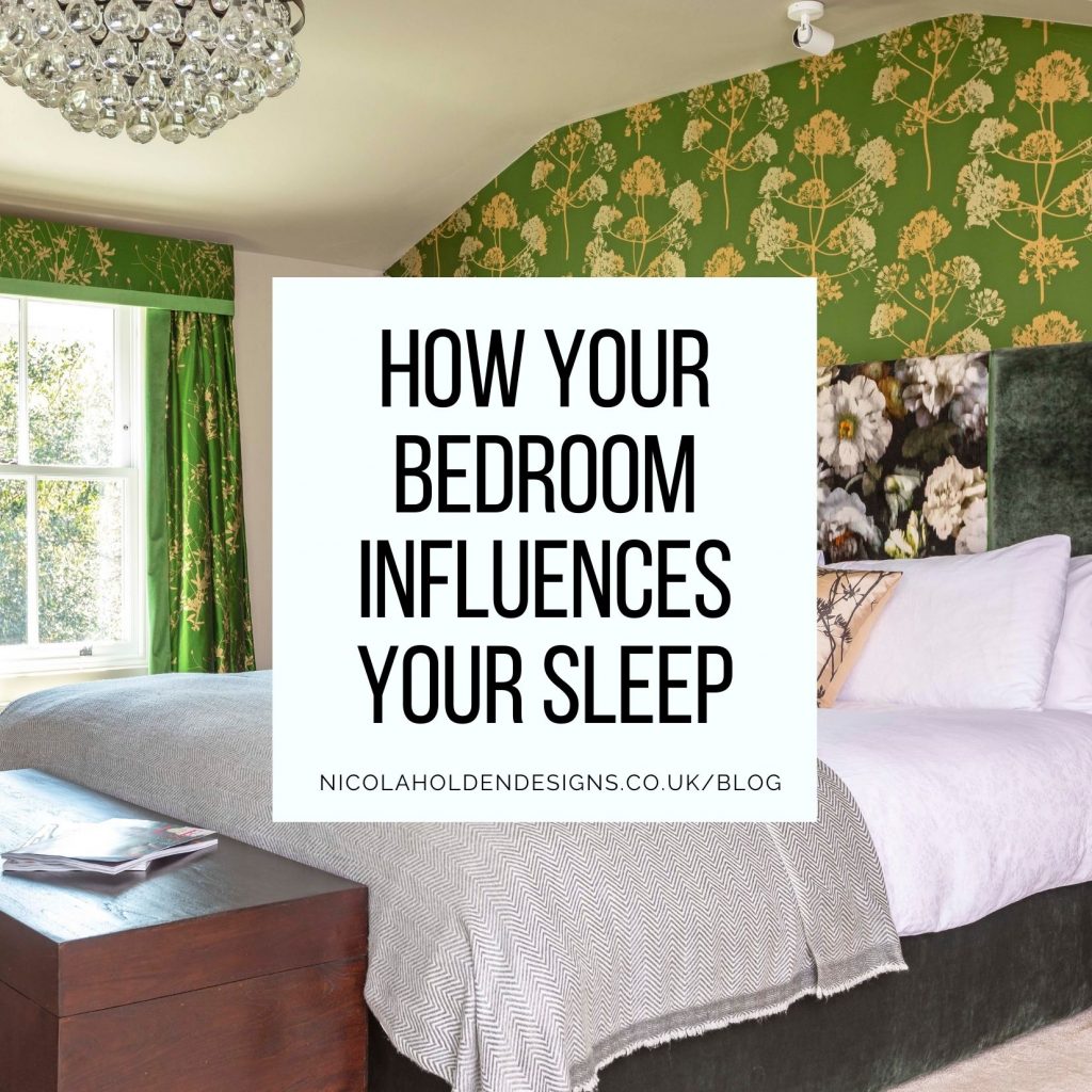
How Your Bedroom Design Influences Your Sleep
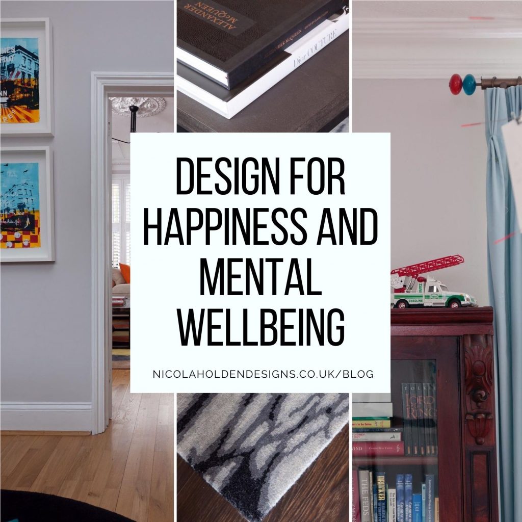
Interior Design for Happiness and Mental Wellbeing
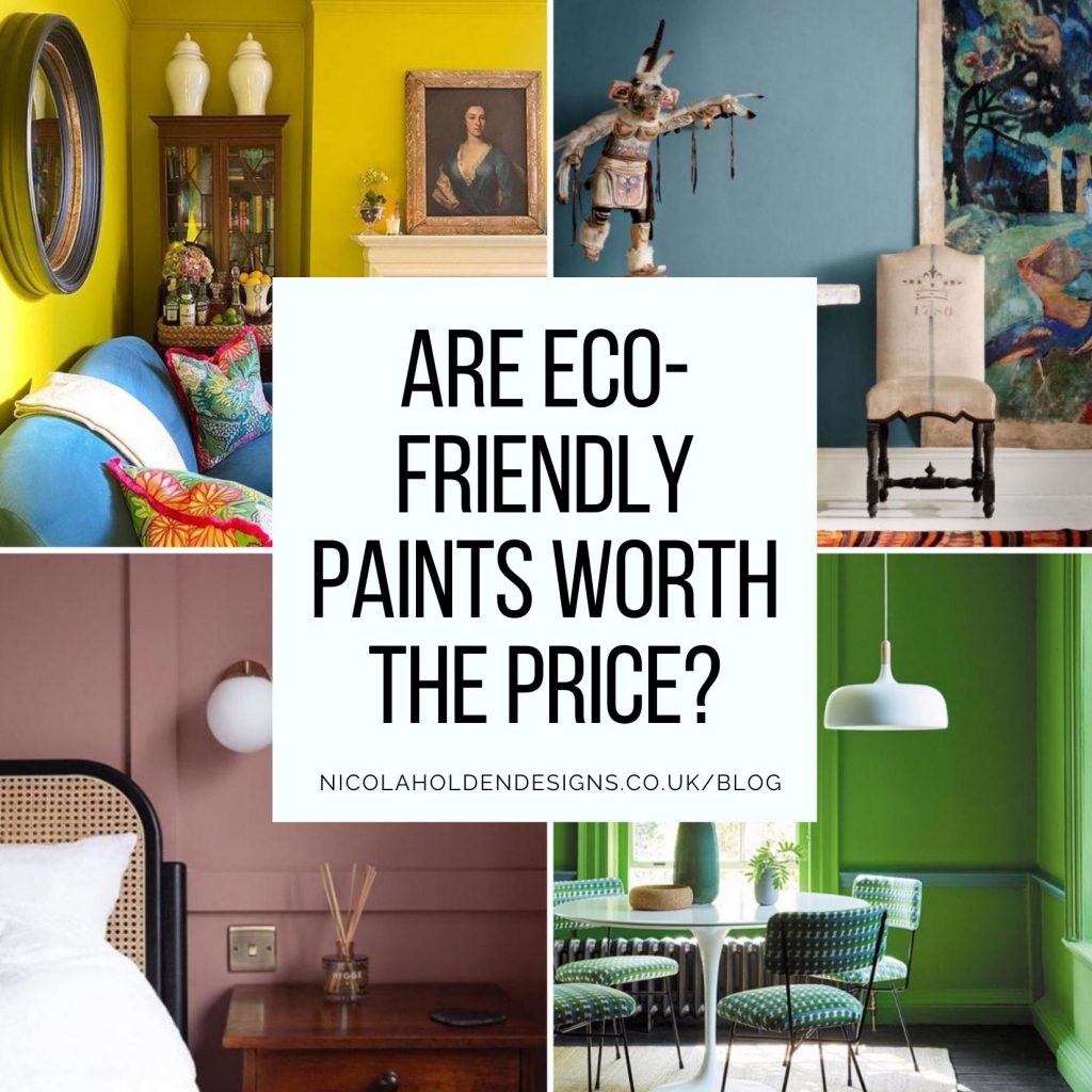
Are Environmentally Friendly Paints Really Worth the Price?
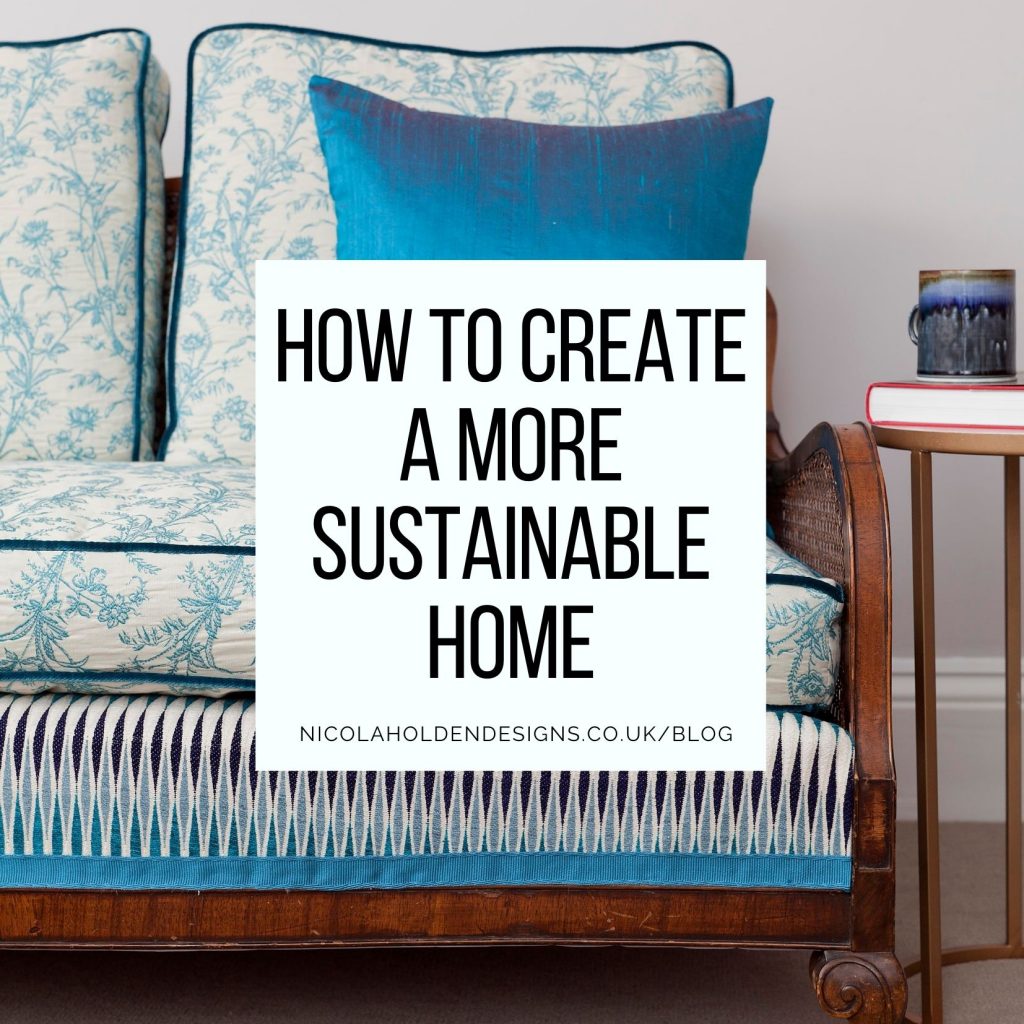
How to Create A More Sustainable Home
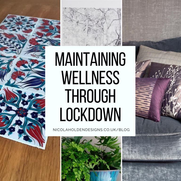
Maintaining Your Wellness Through Yet Another Lockdown
24 Days of Art
Decorating for Christmas
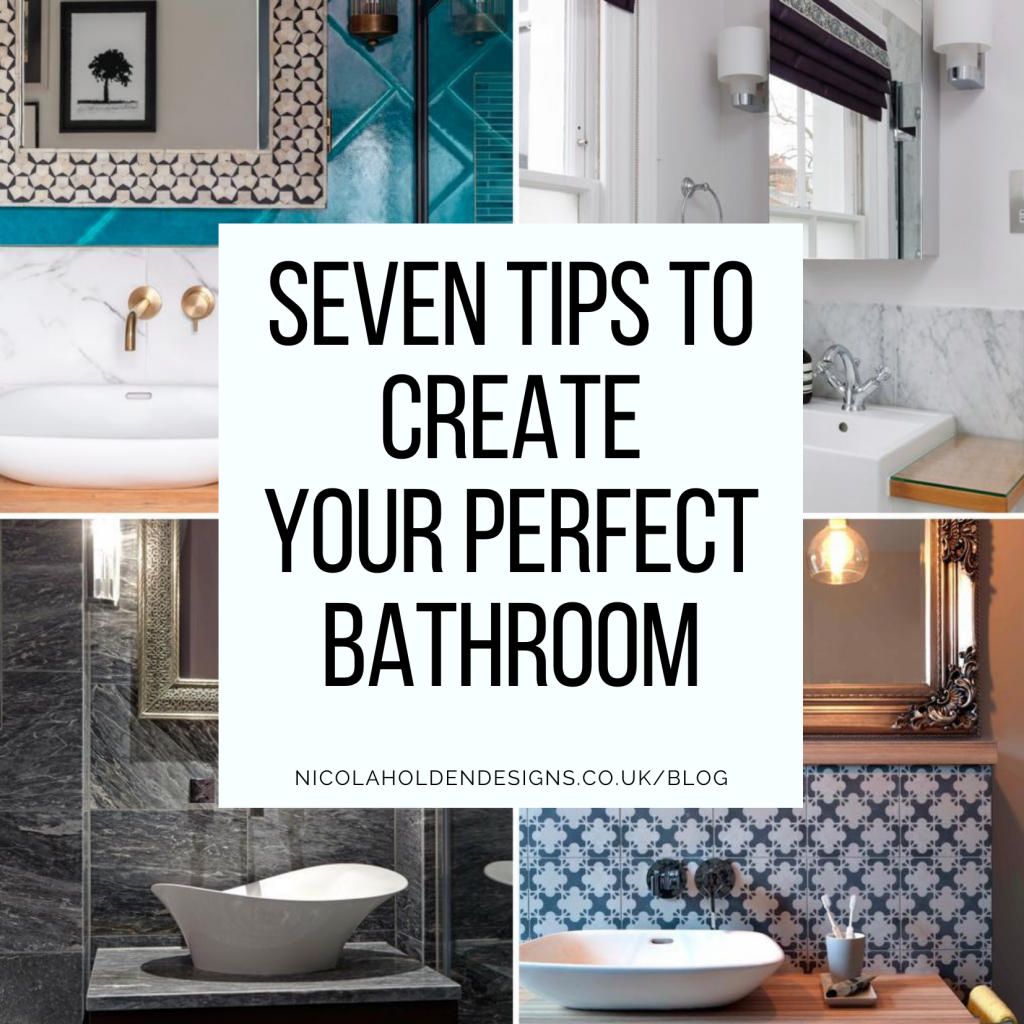
How To Design Your Bathroom: Seven Tips To Create The Perfect Space
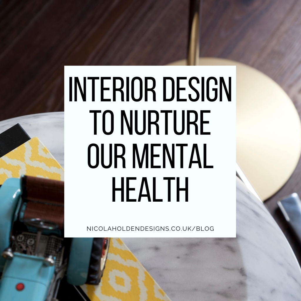
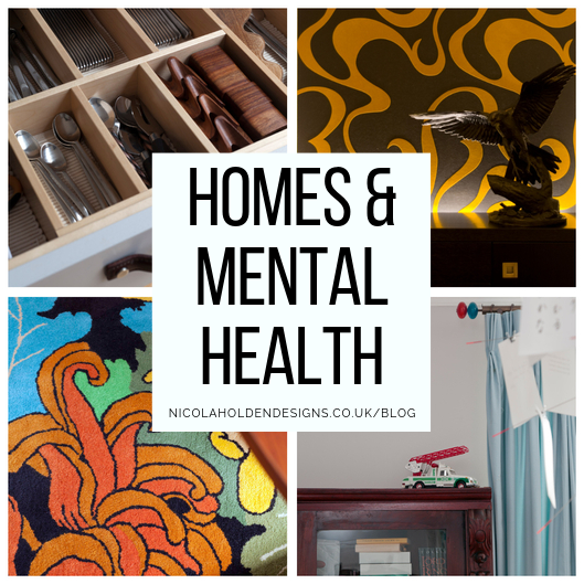
How Can We Design Our Homes to Nurture Our Mental Health?
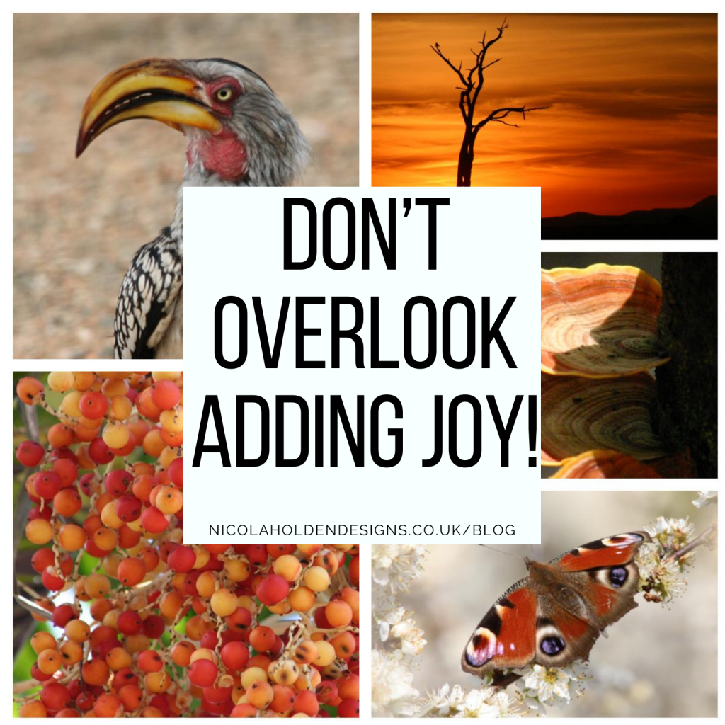
Biophilia is Important, but Don’t Overlook Adding Joy!
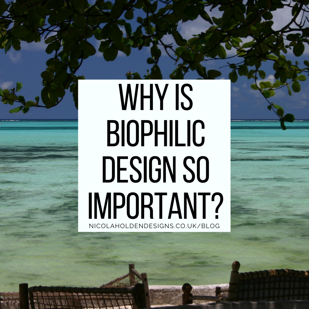
Why is Biophilic Design so Important?
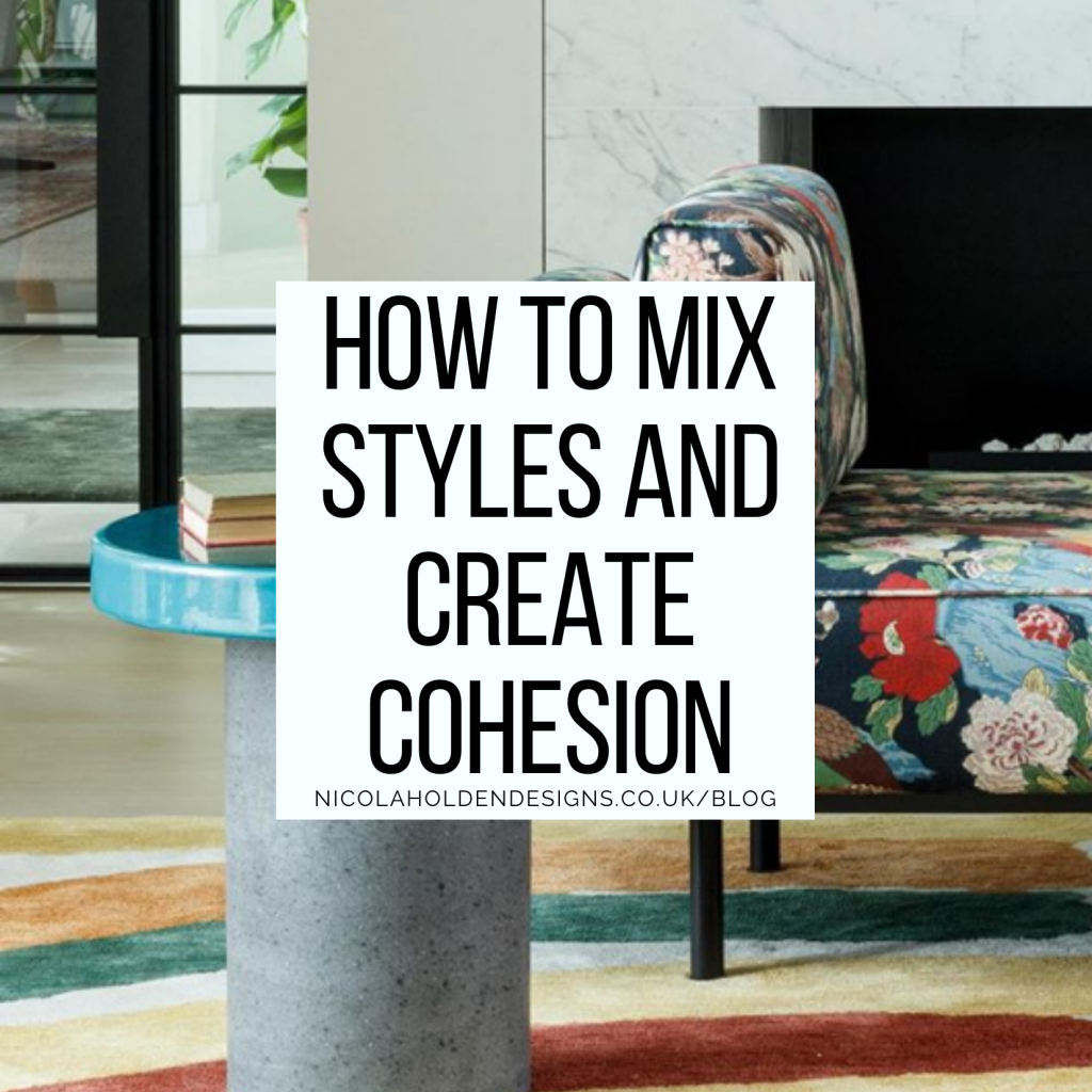
How to Mix Styles Whilst Still Creating a Cohesive Whole
How to Maximise your Space
Is Your Home a Happy Home?
Finding sanctuary in our homes
Choosing Colour for how you Want your Home to Make you FEEL and BEHAVE
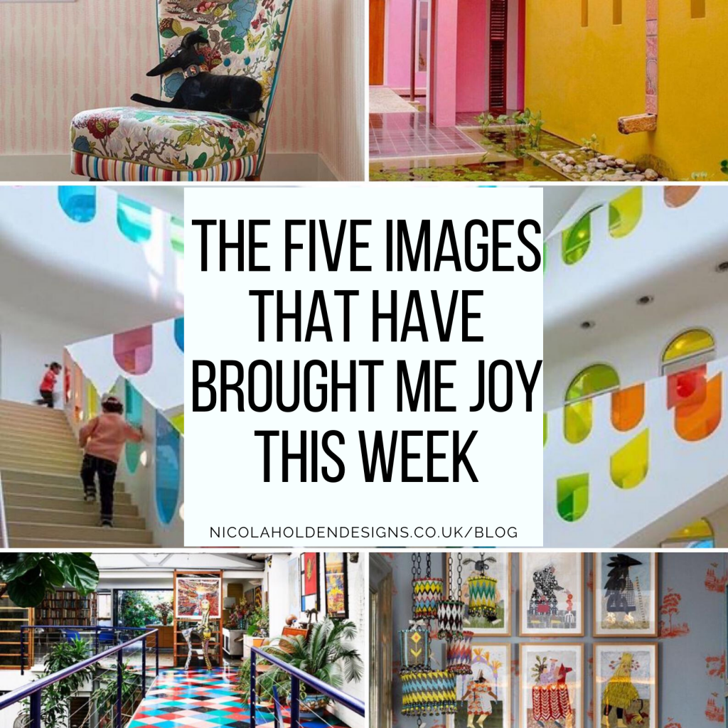
The Five Images That Have Brought Me Joy This Week
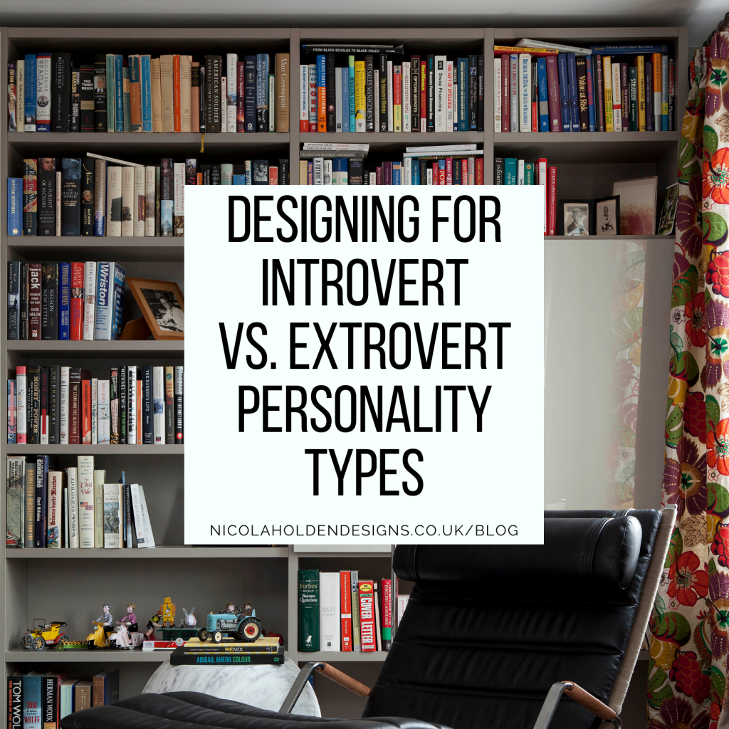
Designing for Introvert vs. Extrovert Personality Types
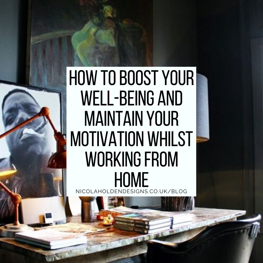
How to Boost your Well-being and Maintain your Motivation whilst Working from Home
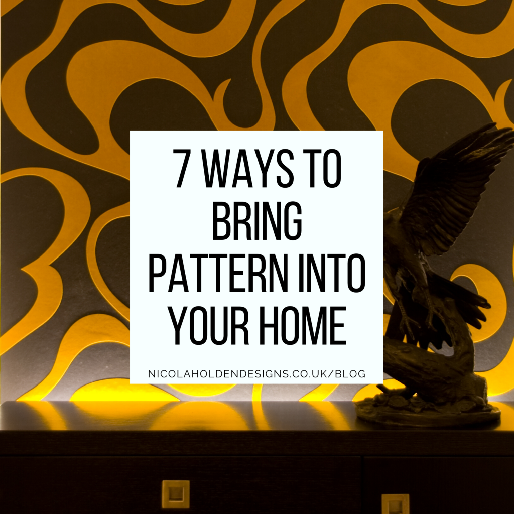
7 Ways to Bring Pattern into your Home
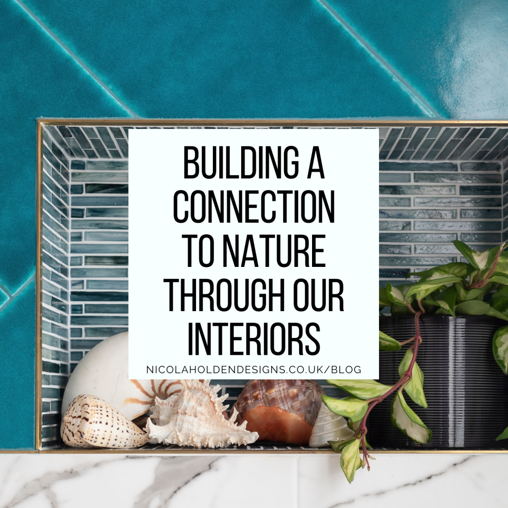
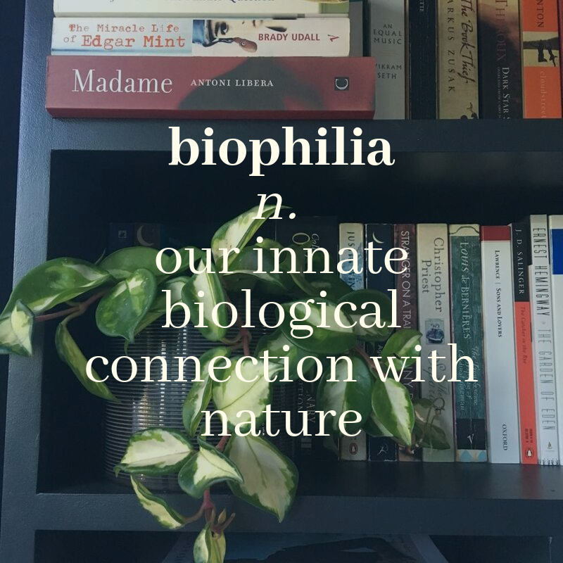
Building a Connection to Nature through our Interiors
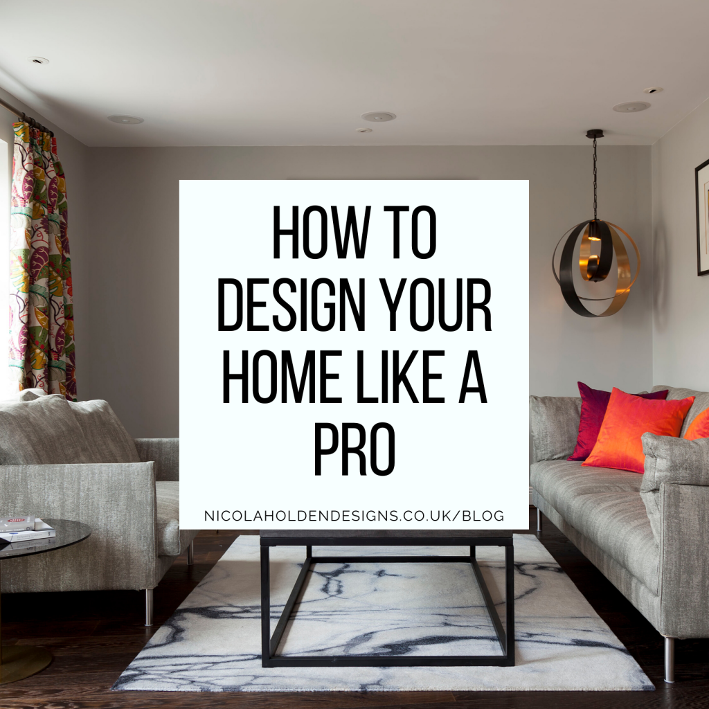
How to Design your Home like a Pro
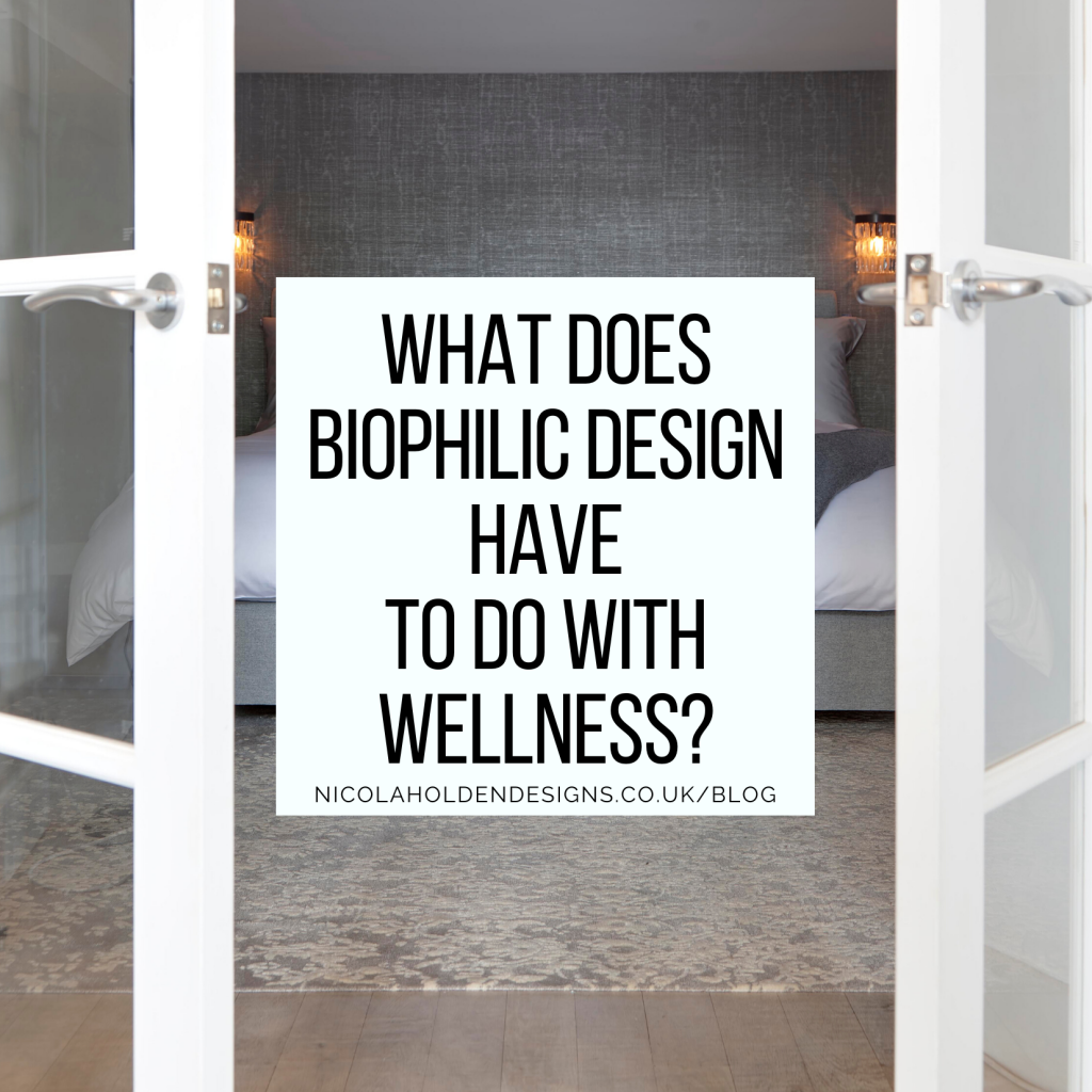
What does Biophilic Design have to do with Wellness?
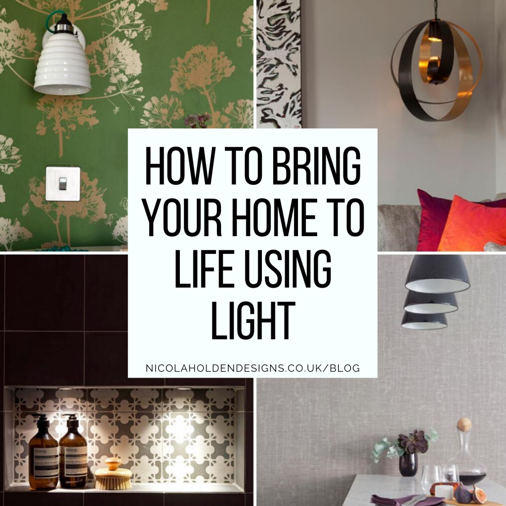
How to Bring your Home to Life using Light
Nine Designer New Year’s Resolutions You Need to Adopt
How to use Colour to Set the Mood in your Home – Part 2
How to use Colour to Set the Mood in your Home – Part 1
Sustainability and Well-being
Does Your Home Bring You Joy?
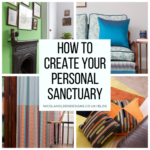
Seven Ways to Transform your House into your own Personal Sanctuary
How Do Our Homes Affect Our Mental Health?
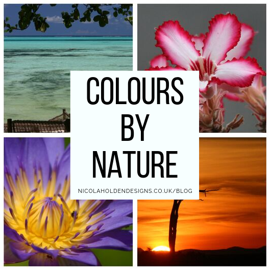
Colours by Nature
Is there more to biophilic design than simply adding pot plants?
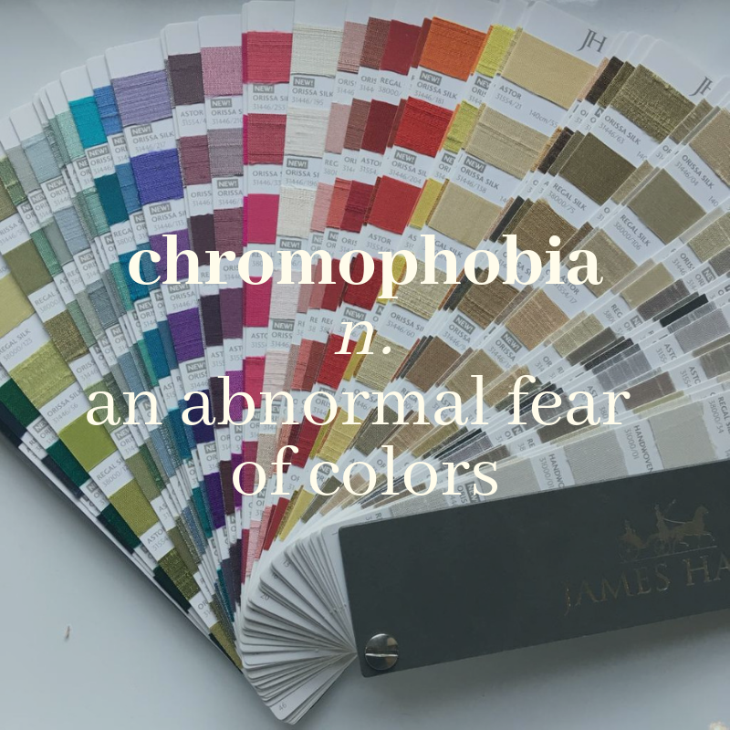
Do You Suffer From Chromophobia?
Blog awards